Help Wizard
Step 1
Type in your question below and we'll check to see what answers we can find...
Loading article...
Submitting...
If you couldn't find any answers in the previous step then we need to post your question in the community and wait for someone to respond. You'll be notified when that happens.
Simply add some detail to your question and refine the title if needed, choose the relevant category, then post.
Just quickly...
Before we can post your question we need you to quickly make an account (or sign in if you already have one).
Don't worry - it's quick and painless! Just click below, and once you're logged in we'll bring you right back here and post your question. We'll remember what you've already typed in so you won't have to do it again.
FAQs
Please see below the most popular frequently asked questions.
Loading article...
Loading faqs...
Ongoing Issues
Please see below the current ongoing issues which are under investigation.
Loading issue...
Loading ongoing issues...
Help categories
Account & Payment
Using Spotify
Listen Everywhere
[Android] Media-style notifications are broken
Solved!- Mark as New
- Bookmark
- Subscribe
- Mute
- Subscribe to RSS Feed
- Permalink
- Report Inappropriate Content
Is the "Media-style notification" broken for anyone else? Since about a week ago I now
- no longer see the large album art in the notification, and
- no longer see the album art on my lock screen.
I believe it's because they changed the number of action items in the notification bar. Android Media-style (in the support library) allows you to put up to 3 action items on the notification. If you put more than 3, Media-style fails and it reverts to ordinary notifications. Spotify recently switched from 3 action items (rewind, play/pause, fast-forward) to 4 action items (add to My Music, rewind, play/pause, fast-forward), so I think this is what caused the problem.
I'm on Android version 6.5.0.1816, Android v6.0.1
Solved! Go to Solution.
- Subscribe to RSS Feed
- Mark Topic as New
- Mark Topic as Read
- Float this Topic for Current User
- Bookmark
- Subscribe
- Printer Friendly Page
Accepted Solutions
- Mark as New
- Bookmark
- Subscribe
- Mute
- Subscribe to RSS Feed
- Permalink
- Report Inappropriate Content
- Mark as New
- Bookmark
- Subscribe
- Mute
- Subscribe to RSS Feed
- Permalink
- Report Inappropriate Content
Hi. I still get the small album cover in the notification and on the lockscreen so that can't be it. I think they removed the 'x' to close to be able to add the back button for those folk who couldn't fiind it in the expanded notification.
- Mark as New
- Bookmark
- Subscribe
- Mute
- Subscribe to RSS Feed
- Permalink
- Report Inappropriate Content
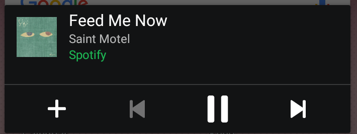
For reference, here's what my notification looks like now:
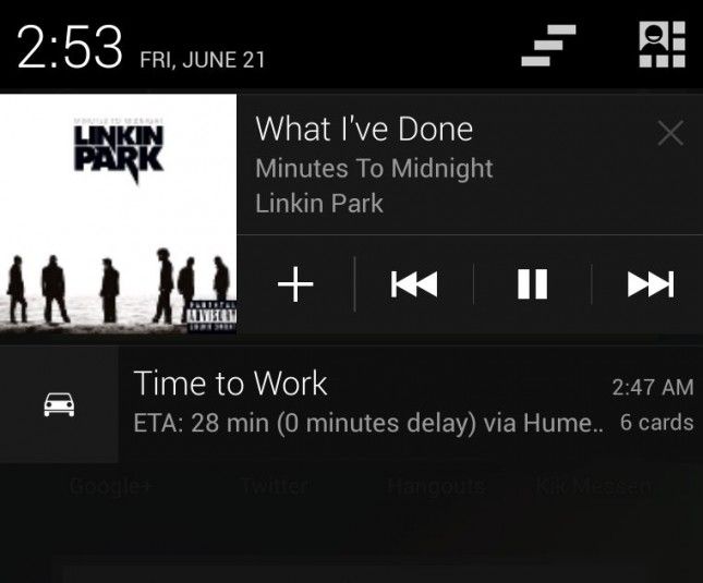
It used to look more like this (image taken from internet):
Do you still get the large album on the left (as in the second photo)?
- Mark as New
- Bookmark
- Subscribe
- Mute
- Subscribe to RSS Feed
- Permalink
- Report Inappropriate Content
Ah no, it's shrunk and the notifications are no longer expandable 😞
- Mark as New
- Bookmark
- Subscribe
- Mute
- Subscribe to RSS Feed
- Permalink
- Report Inappropriate Content
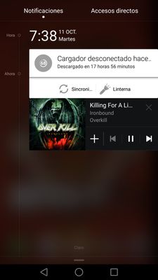
Hi! I'm using the Huawei P9 and this was how the notification looked in the version 6.1.0.1088 armV7.

****
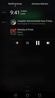
And after I updated, it looks like this

According to Spotify (I talked with them through twitter) the notification will be shown in different ways according to the device, and they keep telling me that this is the way the bar should be shown, but I think is an awful desing.
I decided don't update the app until they change this design to something better
- Mark as New
- Bookmark
- Subscribe
- Mute
- Subscribe to RSS Feed
- Permalink
- Report Inappropriate Content
Suggested posts
Let's introduce ourselves!
Hey there you, Yeah, you! 😁 Welcome - we're glad you joined the Spotify Community! While you here, let's have a fun game and get…

