- Home
- Help
- Your Library
- Re: Desktop: New Your Library sidebar
Help Wizard
Step 1
Type in your question below and we'll check to see what answers we can find...
Loading article...
Submitting...
If you couldn't find any answers in the previous step then we need to post your question in the community and wait for someone to respond. You'll be notified when that happens.
Simply add some detail to your question and refine the title if needed, choose the relevant category, then post.
Just quickly...
Before we can post your question we need you to quickly make an account (or sign in if you already have one).
Don't worry - it's quick and painless! Just click below, and once you're logged in we'll bring you right back here and post your question. We'll remember what you've already typed in so you won't have to do it again.
FAQs
Please see below the most popular frequently asked questions.
Loading article...
Loading faqs...
Ongoing Issues
Please see below the current ongoing issues which are under investigation.
Loading issue...
Loading ongoing issues...
Help categories
Account & Payment
Using Spotify
Listen Everywhere
Desktop: New Your Library sidebar
Solved!- Mark as New
- Bookmark
- Subscribe
- Mute
- Subscribe to RSS Feed
- Permalink
- Report Inappropriate Content
Spotify is introducing a new Your Library sidebar in the desktop app and Web Player.
The new Your Library sidebar improves navigation and makes it easier and faster to collect and retrieve all types of content, bringing new features to desktop that you're already familiar with in the mobile app. The new sidebar is also more customizable than before to meet different preferences.
This thread is your go-to destination for learning what's new, asking questions, getting help for issues you might have, as well as to share your feedback about the new Your Library sidebar for desktop. Also, do you have any tips for other users on how you are using the new Your Library sidebar? We'd love to hear them.
What's new in the Your Library sidebar?
- See your entire collection and all of the content types (not just playlists)
- Filters for your collection (Playlists, Artists, Albums, Podcasts) that can be combined with other filters (By you, By Spotify, Downloaded)
- Sort options for your collection (Recents, Recently Added, Alphabetical, Creator, Custom Order)
- Chosen filters and sort options will be remembered in the sidebar across restarts of the desktop app
- Search through your collection in the sidebar
- Pinned library items to find your favorites, faster – current limit is 4 (Playlists, Playlist Folders, Artists, Albums, Podcasts)
- Art covers are now shown in the sidebar
- Compact library layout (no art covers) is available as an option in Settings to increase content density
- Dedicated + (plus) button to create Playlists and Playlist Folders
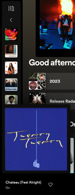
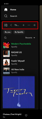
- Flexible Sizing: A collapsed library view (with only art covers) to maximize the browsing area, a regular width view, and an expanded view for more focused library management and curation. (you can also drag to customize the size)
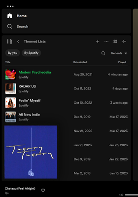
- In the expanded library view, you have options for list view, compact view, and a grid view. The list and compact views show you more details in 2 columns, Date Added and Last Played, and the grid view allows you to see larger art covers.
- Playlist Folders can still be expanded into the sidebar in a tree view, and now when you click on them, the sidebar only shows the Playlist Folder and what's inside for a more focused view.
- Menu option to move a playlist to a folder (with search)
Note: The Your Library sidebar experience will be the same for the most part in the Web Player. However, the Web Player does not support all of the features found in the desktop app. To be able to use all of the features, you can download the desktop app right here.
Tips to get started:
If you need a familiar experience to help you get started with the new Your Library sidebar, here's how to get it as close as possible to the old sidebar that previously only showed playlists:
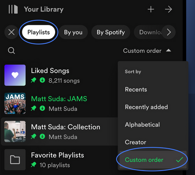
- In the left "Your Library" sidebar, click on the "Playlists" filter at the top.
- Then, in the drop down menu select "Custom Order" under "Sort by". You will then see your previous playlist order and be able to move your playlists and folders like before.
- Your currently chosen filters and sort options will be remembered across restarts of the desktop app.
- If you would like to only see text in the Your Library sidebar (no art covers), go to the drop down menu and at the bottom of the menu click on "Compact" under "View as".
- Flexible Sizing: You can drag the Your Library sidebar to different sizes. Fully expand the sidebar by clicking the arrow button at the top, and fully collapse the sidebar by clicking on the "Your Library" heading to see only art covers.
- At the top, you can scroll through the different filters with your mouse scroll wheel for faster navigation when the sidebar is set to a smaller size.
Walkthrough of the basics:
Sidebar List:
You can now see your entire collection and all of the content types (not just playlists) in the sidebar list. At the top, click on the filters to filter the content you want to see, and click on the drop down menu to change the sort order or view of the list. To create a new Playlist or Playlist Folder, click on the + (plus) button at the top right corner of the sidebar. To search through your collection, click on the search button.
Filter Options:
At the top, click on the filters to filter the content you want to see. You can scroll through the different filters with your mouse scroll wheel for faster navigation when the sidebar is set to a smaller size.
To remove the filter, click on the X or the currently selected filter and then choose another filter to see another type of content. Having no filter selected will show all types of content mixed in the list.
- Playlists
- Artists
- Albums
- Podcasts & Shows
- These can be combined with other filters: By you, By Spotify, Downloaded
Sort Options:
At the top, click on the drop down menu to change the sort order of the list under "Sort by".
- Recents
- Recently Added
- Alphabetical
- Creator
When the "Playlists" filter is selected, you have the option to see your playlists in your own custom order.
- Custom Order
When the "Podcasts & Shows" filter is selected, you have the following option:
- Recently Updated
View Options:
At the top, click on the drop down menu to change the view of the list under "View as".
- Compact (view text only without art covers)
- List
- Grid (bigger art covers)
Flexible Sizing:
You can hover over and click on the right edge of the sidebar to drag it to your preferred width. You can also fully expand the sidebar by clicking the arrow button at the top, and fully collapse the sidebar by clicking on the "Your Library" heading to see only art covers.
In the expanded library view, you have options for list view, compact view, and a grid view. The list and compact views show you more details in 2 columns, Date Added and Last Played, and the grid view allows you to see larger art covers.
FAQ:
This section will answer your frequently asked questions and will be updated with the latest answers.
Related help articles on the support website:
• Your Library • Sort and filter • Keyboard Shortcuts
Can I view the Your Library page in the main browsing area like before?
- Unfortunately, the old Your Library page in the main browsing area is being discontinued with the release of the new Your Library sidebar. You can adjust the size of the Your Library sidebar to be bigger and you can also enable the "grid view" if you would like to see bigger art covers.
How do I see only my playlists in the sidebar like I used to be able to, I can't drag and move my playlists or folders anymore?
-
In the left "Your Library" sidebar, click on the "Playlists" filter at the top.
Then, in the sort options drop down menu select "Custom Order". You will then see your previous playlist order and be able to move your playlists and folders like before.
Your currently chosen filters and sort options will be remembered across restarts of the desktop app.
I don't want to see art cover images in the sidebar, how do I turn them off?
- If you would like to only see text in the Your Library sidebar (no art covers), go to the drop down menu and at the bottom of the menu click on "Compact" under "View as".
How do I get the album art to expand in the bottom left corner like before? When I try to expand the album art, it opens the Now Playing View sidebar to the right.
-
Unfortunately, that is no longer possible. When you expand the album art in the bottom left corner of the app, it will no longer hover over the Your Library sidebar. Instead, the new right sidebar will open up. You can resize the Now Playing View sidebar to your preferred size.
You can read more information about this by going here.
How do I play or shuffle play a Playlist Folder now? (I don't see dedicated pages with play / shuffle options anymore)
- Right click on a Playlist Folder and select the "Play" option. To shuffle play, make sure to turn on the shuffle mode first before selecting the "Play" option in the right click menu.
How do I get to my Local Files now?
-
In the left "Your Library" sidebar, click on the "Playlists" filter at the top.
Then, in the sort drop down select "Custom Order".
The "Local Files" playlist will be near the top of the list under your pinned items (if any).
Feedback:
Where can I give my feedback about the new Your Library sidebar in the desktop app?
- We welcome your feedback about this change. The best way to share your feedback is to comment here in this thread.
Solved! Go to Solution.
- Subscribe to RSS Feed
- Mark Topic as New
- Mark Topic as Read
- Float this Topic for Current User
- Bookmark
- Subscribe
- Printer Friendly Page
Accepted Solutions
- Mark as New
- Bookmark
- Subscribe
- Mute
- Subscribe to RSS Feed
- Permalink
- Report Inappropriate Content
Hey everyone,
Thank you for participating in this thread and sharing your feedback about the new Your Library experience on desktop.
Before anything else, we want to assure you that we're reviewing your comments and forwarding each individual user's feedback to the relevant team here at Spotify.
We'd also like to address some of the most common issues we've noticed being mentioned here:
My playlists are out of order after the update (mentioned by @Sylis_ca, @oauo, @sergioro, and others)
- As outlined in Matt's comment here, you should be able to see the original order by selecting Playlists - Custom Order in the filters section of your sidebar. Once this is selected, you can rearrange your playlists in whatever way you like.
- Please note that you can't reorder Liked Songs, Your Episodes or Local Files - they will always be at the top.
- You can "pin" items at the top of the list above these items though - this is currently limited to 4 items.
I'm unable to move playlists/folders out of a folder (pointed out by @RectangleSquare, @Hencraft, @thisisgok, and others)
- To move playlists and folders, they don't have to be sorted by Custom Order, but it may make it easier to understand where it's being moved to.
- You can open a folder using the arrow to the right of the folder. This can make it easier to drag something out into a new location.
- You can also drag a folder/playlist and hover over the sidebar back button/arrow (at top of Library) and this will update the visible structure, allowing you to place it in the desired position.
The Library sidebar has limited width
- We're happy to announce that after sharing your feedback, this was changed to make it wider.
Once again, thank you for sharing your constructive criticism and helping to make Spotify better!
- Mark as New
- Bookmark
- Subscribe
- Mute
- Subscribe to RSS Feed
- Permalink
- Report Inappropriate Content
Updates:
This section is reserved to inform you of updates to the new Your Library sidebar such as changes and new features.
September 2023:
- "Compact View" option has moved to the drop down menu
The "Compact View" option has moved from the settings page. You can now select this option directly from the Your Library sidebar.
At the top, click on the drop down menu to change the view of the list under "View as".- Compact (view text only without art covers)
- List
- Grid (bigger art covers)
- "Grid View" option is now available when the sidebar is set to a smaller width
You can now select the "Grid View" option from the drop down menu to see bigger art covers when the sidebar is set to a smaller width and not fully expanded with the arrow button at the top.
June 2023:
- New "Now Playing View" right sidebar
Spotify is introducing a new "Now Playing View" sidebar in the desktop app and Web Player to go along with the recently released "Your Library" sidebar. The Now Playing View in the right sidebar shows the album art and info of the current song or podcast you are playing and also shows more information about the artist.
When you expand the album art in the bottom left corner of the app, it will no longer hover over the Your Library sidebar. Instead, the new right sidebar will open up. You can resize the Now Playing View sidebar to your preferred size.
You can read more information about this by going here.
- Your Library sidebar width can now be made wider
Thanks for your feedback about the maximum Your Library width size. You can now drag the Your Library sidebar to be even wider.
- Mark as New
- Bookmark
- Subscribe
- Mute
- Subscribe to RSS Feed
- Permalink
- Report Inappropriate Content
Thanks for the detailed update @MattSuda!
Is there a timeline for when the new UI to be rolled out to all users? I got the change once (without the sidebar) in early February and it went away after an hour, never to be seen by my client again.
Also, another user noted that the meatball menu that used to be in the upper left corner is no longer there. Has this been relocated, or removed entirely?
- Mark as New
- Bookmark
- Subscribe
- Mute
- Subscribe to RSS Feed
- Permalink
- Report Inappropriate Content
Any new folders I create are not showing up in my Windows Desktop App, they show up on my iPhone app but I can't move or change the folder name from New Folder on there.
- Mark as New
- Bookmark
- Subscribe
- Mute
- Subscribe to RSS Feed
- Permalink
- Report Inappropriate Content
Listen I been a paying member of Spotify for years at this point. I am also in development. When you make changes to your app please consider current users.
Over the years I have worked to cultivate my playlists in specific order. Those playlists apart from the great service is what keeps me here.
I get having to progress but at this point your updates are getting in the way of me just listening to music. Do not force me and others to move off this service. The last couple changes feel to me like they are getting in the way of just listening to music.
- Mark as New
- Bookmark
- Subscribe
- Mute
- Subscribe to RSS Feed
- Permalink
- Report Inappropriate Content
I cannot sort by custom order on the desktop app (see photo). Also, why is there a four pin limit? This new UI is pretty awful (it was bad on the iOS app), and I'd like my desktop app to look as much like the old version as possible, which seems to be the consensus among people on Spotify forums.

- Mark as New
- Bookmark
- Subscribe
- Mute
- Subscribe to RSS Feed
- Permalink
- Report Inappropriate Content
- Mark as New
- Bookmark
- Subscribe
- Mute
- Subscribe to RSS Feed
- Permalink
- Report Inappropriate Content
No, I hadn't. Thanks for clarifying that.
- Mark as New
- Bookmark
- Subscribe
- Mute
- Subscribe to RSS Feed
- Permalink
- Report Inappropriate Content
please change it back. this is so cluttered and it's a much worse experience for me than before. there's so much going on, i dont know why this was changed from the straightforward and minimal desktop app. please give us an option to change it back to the normal one.
- Mark as New
- Bookmark
- Subscribe
- Mute
- Subscribe to RSS Feed
- Permalink
- Report Inappropriate Content
It's quite annoying that filters do not persist after closing and reopening the app. I don't like the floating album art, it is no longer resizeable and side scrolling depending on the zoom, resolution, and size of the left bar is quite annoying. I liked looking at my favorited albums full screen, the only workaround I have found is SHIFT+ALT+3. Using and doing certain things now requires MORE user intervention which is the absolute opposite of what you want. I always want my songs and playlists to be in CUSTOM order. I hope to see this improved, this very much feels like beta software.
- Mark as New
- Bookmark
- Subscribe
- Mute
- Subscribe to RSS Feed
- Permalink
- Report Inappropriate Content
Hey @Fuzziekiwi
According to the post, your filters and sorting order should persist after closing the app, and the sidebar should be resizable. It's possible that your client is still on an experimental version. Please check for an update, or reinstall your client using these steps.
- Mark as New
- Bookmark
- Subscribe
- Mute
- Subscribe to RSS Feed
- Permalink
- Report Inappropriate Content
Thank you for the detailed explanation of the new interface. I'm really glad the custom order option is still possible.
- Mark as New
- Bookmark
- Subscribe
- Mute
- Subscribe to RSS Feed
- Permalink
- Report Inappropriate Content
Looks like this was fixed since a few days ago. I just tested it. No intervention from my end. The sidebar is resizable yes, but I don’t want that left bar to take up so much space and having to constantly resize it and not be able to view my playlist folder in full screen is absolutely annoying.
- Mark as New
- Bookmark
- Subscribe
- Mute
- Subscribe to RSS Feed
- Permalink
- Report Inappropriate Content
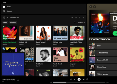
I like to view the album art of what I am playing while browsing through music/albums/playlist. This interface makes it much more annoying to navigate, even with the bar at it's full size. Just feels so cluttered. I don't want to be constantly resizing this and messing around with the UI to get to what I want to play and discover.
- Mark as New
- Bookmark
- Subscribe
- Mute
- Subscribe to RSS Feed
- Permalink
- Report Inappropriate Content
Please change it back! Why should I give up on half of my desktop size to have an overview of my albums and artists? I think it's a huge downgrade and makes my browsing experience much worse.
- Mark as New
- Bookmark
- Subscribe
- Mute
- Subscribe to RSS Feed
- Permalink
- Report Inappropriate Content
I don't want to see art cover images in the sidebar, how do I turn them off?
- If you would like to only see text in the Your Library sidebar (no art covers), go to the Spotify app Settings ➜ Library ➜ and turn on "use compact library layout".
Great, now add the same preference for songs listed inside playlists and I'll come back to premium.
- Mark as New
- Bookmark
- Subscribe
- Mute
- Subscribe to RSS Feed
- Permalink
- Report Inappropriate Content
I had the 'listening now' feature on my desktop app and I love it, I think it should be fully added to the desktop app. This feature allows me to see all of the information I like to see at once - and I can have the lyrics pulled up as well which is another important feature to me.
- Mark as New
- Bookmark
- Subscribe
- Mute
- Subscribe to RSS Feed
- Permalink
- Report Inappropriate Content
Where did the right sidebar go for Windows desktop? I just had it and fat-fingered closing it. This sidebar showed upcoming tours, merch, and the next in the queue.
This showed up in the same place as "Friend Activity" and was enabled by a small icon in the bottom right-hand corner of the application. Since this new update, the icon that was used to enable this right sidebar is since gone.
- Mark as New
- Bookmark
- Subscribe
- Mute
- Subscribe to RSS Feed
- Permalink
- Report Inappropriate Content
Can we please get the option to revert the desktop UI to an older version? Give people the option to use the new (in my opinion clunky) UI or an older version they are used to.
- Mark as New
- Bookmark
- Subscribe
- Mute
- Subscribe to RSS Feed
- Permalink
- Report Inappropriate Content
Yeah it's an absolute shame Spotify is sticking to their guns with this atrocious new Sidebar concept. It breaks the entire app. Your Library is the absolute most important part of the entire desktop app, and now it's squeezed into this annoying side bar, that you have to drag out and resize to even see a few of the hundreds of artists I follow. Absolutely absurd UI design. I've been a Spotify subscriber for 8 years and cancelled for good after this update.
On the plus side, since Spotify decided to destroy their desktop app, I finally downloaded and tried TIDAL, and it's so much better, and a breath of fresh air. Well designed desktop app, like Spotify used to be years ago, and a pleasure to use. I urge everyone else to give it a try.
Suggested posts
Let's introduce ourselves!
Hey there you, Yeah, you! 😁 Welcome - we're glad you joined the Spotify Community! While you here, let's have a fun game and get…


