Help Wizard
Step 1
Type in your question below and we'll check to see what answers we can find...
Loading article...
Submitting...
If you couldn't find any answers in the previous step then we need to post your question in the community and wait for someone to respond. You'll be notified when that happens.
Simply add some detail to your question and refine the title if needed, choose the relevant category, then post.
Just quickly...
Before we can post your question we need you to quickly make an account (or sign in if you already have one).
Don't worry - it's quick and painless! Just click below, and once you're logged in we'll bring you right back here and post your question. We'll remember what you've already typed in so you won't have to do it again.
FAQs
Please see below the most popular frequently asked questions.
Loading article...
Loading faqs...
Ongoing Issues
Please see below the current ongoing issues which are under investigation.
Loading issue...
Loading ongoing issues...
Help categories
Account & Payment
Using Spotify
Listen Everywhere
Horrific layout update (version 8.4.88.150)
Horrific layout update (version 8.4.88.150)
- Mark as New
- Bookmark
- Subscribe
- Mute
- Subscribe to RSS Feed
- Permalink
- Report Inappropriate Content
Plan
Premium
Country
USA
Device
Sony Xperia XZ Premium
Operating System
Android 9 (Pie)
Just updated the app to version 8.4.88.150
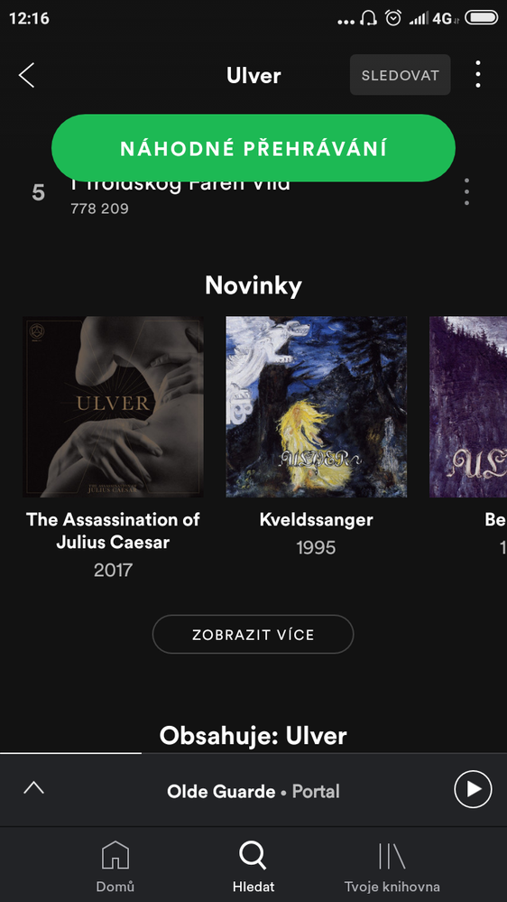
Upon entering an artist name in search, when you look at "Releases" (which now scrolls horizontally) there is no further breakdown such as "Singles", "Compilations", and playlists are gone as well.
I will note that underneath the "Releases" row there is a spot where you can tap "See More". Thinking those other categories might be found there, I tapped that - and nothing happens.
Is anyone else experiencing this?
I tried clearing data, uninstalling updates, reinstalling - and it is still doing the same thing.
- Subscribe to RSS Feed
- Mark Topic as New
- Mark Topic as Read
- Float this Topic for Current User
- Bookmark
- Subscribe
- Printer Friendly Page
- Mark as New
- Bookmark
- Subscribe
- Mute
- Subscribe to RSS Feed
- Permalink
- Report Inappropriate Content
Hi there!
If you don't like the new update I’d suggest starting a new thread in the Community Ideas Exchange.
This’ll allow users, Stars, and Moderators to vote and comment on it.
Also, could you share a screenshot of this change. The artists profile has been reorganized but it has all the previous sections.
Hope it helps 🙂
- Mark as New
- Bookmark
- Subscribe
- Mute
- Subscribe to RSS Feed
- Permalink
- Report Inappropriate Content
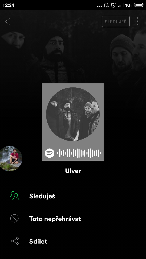
Same problem there, im sending some pictures
- Mark as New
- Bookmark
- Subscribe
- Mute
- Subscribe to RSS Feed
- Permalink
- Report Inappropriate Content
I agree.
I hate that new version, where you can no longer find the albums, singles, compilations, etc. as you used to.
Why that change ? What improvment does it bring ?
Is there a way to come back to the old version ?
- Mark as New
- Bookmark
- Subscribe
- Mute
- Subscribe to RSS Feed
- Permalink
- Report Inappropriate Content
I joined the beta program a while ago and they haven't implemented this update there yet. I really hope this isn't the direction they're taking Spotify - it's nearly the same as my experience using Amazon and Apple Music... I hate everything meshed together, nothing in chronilogical order... It's a mess and one of the reasons I've stuck with Spotify as long as I have.
- Mark as New
- Bookmark
- Subscribe
- Mute
- Subscribe to RSS Feed
- Permalink
- Report Inappropriate Content
Same issue here. I want to listen to albums, I like listening to albums. This new layout makes it an absolute pain to find albums.
Really don't like it!
- Mark as New
- Bookmark
- Subscribe
- Mute
- Subscribe to RSS Feed
- Permalink
- Report Inappropriate Content
Yep same here. Why on earth woud they lump all releases together with no indication as you whether you are scrolling over albums or singles or compilations. And that scrolling...what a load of sh*te. Absolutely detest it!
- Mark as New
- Bookmark
- Subscribe
- Mute
- Subscribe to RSS Feed
- Permalink
- Report Inappropriate Content
I thought I was the only one getting this. I was getting so frustrated. It's horrible. I was trying to listen to Motorhead and I couldn't find the album I was looking for unless I wrote it on the search bar. What improvements did this update bring? Nothing. How do I know if it is a album, a compilation or a single? I have to click on it to check what it is. And having to scroll horizontally to find the album? Try doing that on a band like Motorhead, you will be doing that all day. The "old way" maybe it wasn't perfect but it was much better than this.
- Mark as New
- Bookmark
- Subscribe
- Mute
- Subscribe to RSS Feed
- Permalink
- Report Inappropriate Content
Same problem here.
The worst thing is, if an artist has more releases, i like to hear audiobooks and some artists have more 100 releases, i can soo only ~15 releases because the see more button won't work.
Horizontal scrolling on a Smartphone is also a bad idea imo.
If there won't be a solution in the near future i will quit spotify. A streamingservice witch didn't shows me all the content makes no sense to me.
- Mark as New
- Bookmark
- Subscribe
- Mute
- Subscribe to RSS Feed
- Permalink
- Report Inappropriate Content
@SoundMixr
If you haven't already done so you can post this as a new idea here.
Edit: seems to be all sorted now.
- Mark as New
- Bookmark
- Subscribe
- Mute
- Subscribe to RSS Feed
- Permalink
- Report Inappropriate Content
I got theold layout again, you guys too?
- Mark as New
- Bookmark
- Subscribe
- Mute
- Subscribe to RSS Feed
- Permalink
- Report Inappropriate Content
Yep mine is back to seperate listings for albums singles etc. So much better 🙂
- Mark as New
- Bookmark
- Subscribe
- Mute
- Subscribe to RSS Feed
- Permalink
- Report Inappropriate Content
Me too ! Great !!
Thanks
- Mark as New
- Bookmark
- Subscribe
- Mute
- Subscribe to RSS Feed
- Permalink
- Report Inappropriate Content
...
Suggested posts
Let's introduce ourselves!
Hey there you, Yeah, you! 😁 Welcome - we're glad you joined the Spotify Community! While you here, let's have a fun game and get…

