Help Wizard
Step 1
Type in your question below and we'll check to see what answers we can find...
Loading article...
Submitting...
If you couldn't find any answers in the previous step then we need to post your question in the community and wait for someone to respond. You'll be notified when that happens.
Simply add some detail to your question and refine the title if needed, choose the relevant category, then post.
Just quickly...
Before we can post your question we need you to quickly make an account (or sign in if you already have one).
Don't worry - it's quick and painless! Just click below, and once you're logged in we'll bring you right back here and post your question. We'll remember what you've already typed in so you won't have to do it again.
FAQs
Please see below the most popular frequently asked questions.
Loading article...
Loading faqs...
Ongoing Issues
Please see below the current ongoing issues which are under investigation.
Loading issue...
Loading ongoing issues...
Help categories
Account & Payment
Using Spotify
Listen Everywhere
How do I hide the DJ and automixes?
Solved!- Mark as New
- Bookmark
- Subscribe
- Mute
- Subscribe to RSS Feed
- Permalink
- Report Inappropriate Content
I want to see and select albums the way the interface previously worked.
Solved! Go to Solution.
- Subscribe to RSS Feed
- Mark Topic as New
- Mark Topic as Read
- Float this Topic for Current User
- Bookmark
- Subscribe
- Printer Friendly Page
Accepted Solutions
- Mark as New
- Bookmark
- Subscribe
- Mute
- Subscribe to RSS Feed
- Permalink
- Report Inappropriate Content
Hey @eniad,
Thanks for getting back to us.
What you're seeing is our new Home feed UI. If you have any feedback regarding this change, we encourage you to share it here.
We hope this helps.
- Mark as New
- Bookmark
- Subscribe
- Mute
- Subscribe to RSS Feed
- Permalink
- Report Inappropriate Content
Hey @eniad,
Thanks for reaching out.
The DJ mode is only active when you start it from the DJ button. To stop it, simply press Stop and start a track from a playlist or album as usual.
If we haven't understood your issue correctly, please provide a bit more info and a short screen recording or a few screenshots of how things look on your end.
Looking forward to your reply.
- Mark as New
- Bookmark
- Subscribe
- Mute
- Subscribe to RSS Feed
- Permalink
- Report Inappropriate Content
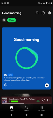
Thank you for your reply. My issue is about the interface, not playback.
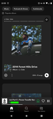
The blue DJ block below takes up the entire Music tab. You can see in the screenshots that I am listening to a song but the DJ block is still there. The home tab is worse because it's just podcasts, which I am not interested in.
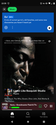
This second screenshot is slightly scrolled down to showing a playlist I am not interested in. It also plays a preview of the playlist while my other music is still playing. (I was able to mute the playlist preview with the mute icon.) I want to see album covers here.
This new interface does not help me find music at all. It makes listening to full album difficult. I have rolled by to version 8.8.16.615. I'll keep that version until the interface improves or a setting allows the album only. A setting would be ideal; I appreciate the fact that different user want to use the app differently.
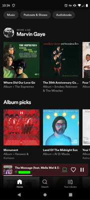
For reference, this is the album cover layout of version 8.8.16.615.
- Mark as New
- Bookmark
- Subscribe
- Mute
- Subscribe to RSS Feed
- Permalink
- Report Inappropriate Content
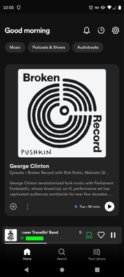
I noticed I am comparing different tabs, so I also grabbed screenshots of the home tab in the new version (8.8.24.408). The large blue DJ block is in the Music tab of both versions of the app. My question still stands on how to dismiss that block. However my complaint needs to be modified. I do not like the large blocks of a podcast, playlist, or album I am not interest in. I prefer to see album covers displayed in the more compact layout of version 8.8.16.615.
The home tab top option is a podcast. I've never listened to a podcast.
The next option is a new album I am not interested in.
I should not have to scroll so much to see albums. There should be an option for 'compact layout' or similar.
- Mark as New
- Bookmark
- Subscribe
- Mute
- Subscribe to RSS Feed
- Permalink
- Report Inappropriate Content
Hey @eniad,
Thanks for getting back to us.
What you're seeing is our new Home feed UI. If you have any feedback regarding this change, we encourage you to share it here.
We hope this helps.
- Mark as New
- Bookmark
- Subscribe
- Mute
- Subscribe to RSS Feed
- Permalink
- Report Inappropriate Content
Thank you. I have added my feedback to that thread.
- Mark as New
- Bookmark
- Subscribe
- Mute
- Subscribe to RSS Feed
- Permalink
- Report Inappropriate Content
This is marked as the solution, but it's not a solution. What I get from this is, "This is the way things are going to be, but if you have feedback, post it in another thread (where it'll simply be ignored)."
- Mark as New
- Bookmark
- Subscribe
- Mute
- Subscribe to RSS Feed
- Permalink
- Report Inappropriate Content
My actual solution has been to turn off updates to the app. Now I see they have added the DJ to the Windows desktop, I'll be turning off updates to that as well if I can.
- Mark as New
- Bookmark
- Subscribe
- Mute
- Subscribe to RSS Feed
- Permalink
- Report Inappropriate Content
Suggested posts
Let's introduce ourselves!
Hey there you, Yeah, you! 😁 Welcome - we're glad you joined the Spotify Community! While you here, let's have a fun game and get…
