Help Wizard
Step 1
Type in your question below and we'll check to see what answers we can find...
Loading article...
Submitting...
If you couldn't find any answers in the previous step then we need to post your question in the community and wait for someone to respond. You'll be notified when that happens.
Simply add some detail to your question and refine the title if needed, choose the relevant category, then post.
Just quickly...
Before we can post your question we need you to quickly make an account (or sign in if you already have one).
Don't worry - it's quick and painless! Just click below, and once you're logged in we'll bring you right back here and post your question. We'll remember what you've already typed in so you won't have to do it again.
FAQs
Please see below the most popular frequently asked questions.
Loading article...
Loading faqs...
Ongoing Issues
Please see below the current ongoing issues which are under investigation.
Loading issue...
Loading ongoing issues...
Help categories
Account & Payment
Using Spotify
Listen Everywhere
Menu Bar Location settings
Menu Bar Location settings
- Mark as New
- Bookmark
- Subscribe
- Mute
- Subscribe to RSS Feed
- Permalink
- Report Inappropriate Content
Premium/USA -Amazon Fire 8 Andriod
With the most recent update to the Spotify app on my Fire, the menu bar location changed to the side w/out any setting being changed on my part. The new location has made spotify nearly useless on my device as it's drastically changed the size and spacing for the words and lists on the main body of the screen. I am sure the decreased space and font sized will be very irritated for some users with vision issues.
The side bar takes up nearly a third of the screen making it very difficult to read, scroll or operate any other list or section of the app, nearly making the whole thing non-functional.
If there was the option to chose menu bar location in setting (as most device's screens have different dimensions and aspect ratios, so certain formations are just not user friendly or functional on all devices) the usability of the app, even after updates, would be increased. Also personal preference and accessibility functions get disrupted when there is no choice on the user's part, but the ability to change settings and the bar location would increase accessibility, and decrease frustration when an update renders an app, that you pay for services on, useless.
Is there any solution to get the menu bar back at the bottom w/out having to completely uninstall the app, turn off updates, and attempt to get a backdated version that still functions?
- Labels:
-
amazon fire
-
andriod
-
Functionality
-
menu
-
menu bar
-
settings
- Subscribe to RSS Feed
- Mark Topic as New
- Mark Topic as Read
- Float this Topic for Current User
- Bookmark
- Subscribe
- Printer Friendly Page
- Mark as New
- Bookmark
- Subscribe
- Mute
- Subscribe to RSS Feed
- Permalink
- Report Inappropriate Content
The play button used to be in the middle, in a large panel. Now it's on the left in a small panel.
Can I change it back?
Thx
- Mark as New
- Bookmark
- Subscribe
- Mute
- Subscribe to RSS Feed
- Permalink
- Report Inappropriate Content
Hey @ezy-e, thanks for reaching out to the Community!
Could you attach a screenshot of what you’re seeing, and let me know what device this happens on, as well as the software version?
Can you let me know if this happened when you updated your Spotify app? Also, let me know if this happens on another similar device.
Keep me posted!
- Mark as New
- Bookmark
- Subscribe
- Mute
- Subscribe to RSS Feed
- Permalink
- Report Inappropriate Content
My Home/Search/Your Library bar has shifted position from the bottom of the screen to the left side. I would like to move it back. Any help on how to do that?
Plan
Premium
Country
USA
Device
Galaxy Tab E
Operating System
Android 7.1.1
My Question or Issue
- Mark as New
- Bookmark
- Subscribe
- Mute
- Subscribe to RSS Feed
- Permalink
- Report Inappropriate Content
I really don't like it either. I want it back to the way it was.
Please can someone help in advising how to put this back.
- Mark as New
- Bookmark
- Subscribe
- Mute
- Subscribe to RSS Feed
- Permalink
- Report Inappropriate Content
Hey there @GrumpiestAnimal,
Thanks for searching for the answer you need here!
Apologies for the delayed response, we just came across this thread.
It's always a good idea to run a clean reinstall to get the latest Spotify app version and see if this will change back to the old design.
If this doesn't help, send us a screenshot displaying how the menu bar looks on your end. You can attach the image to your next response to us by using the Insert Photos option in the post editor. This way we can take a closer look at the issue.
Hope this helps. Keep us posted.
- Mark as New
- Bookmark
- Subscribe
- Mute
- Subscribe to RSS Feed
- Permalink
- Report Inappropriate Content
- Mark as New
- Bookmark
- Subscribe
- Mute
- Subscribe to RSS Feed
- Permalink
- Report Inappropriate Content
Still the same, I have updated the app several times now and and every time there's a new update I cross my fingers to only find that the problem still occurs.
I wonder whether Spotify is aware of this bug or not.
- Mark as New
- Bookmark
- Subscribe
- Mute
- Subscribe to RSS Feed
- Permalink
- Report Inappropriate Content
i've installed the app on a new samsung A2 tablet. the status bar is hanging, and the "new layout" with the small left side does not work properly... it would be very nice if we have the option to change the layout from old to new and back... but, once again, something with the new layout is wrong...
we are 5 people using the same tablet, each with different username/pwd. 3 of us have the new layout, 2 of us have the old layout (most of time, but sometimes the new layout appears... then after a restart, the old layout comes back..) very strange...
- Mark as New
- Bookmark
- Subscribe
- Mute
- Subscribe to RSS Feed
- Permalink
- Report Inappropriate Content
Team, I'm experiencing the same navigation bar problem on my Nexus 7 2013, running Android 6. Even after clean install, the navigation bar is on the left side. Screenshot is attached.

- Mark as New
- Bookmark
- Subscribe
- Mute
- Subscribe to RSS Feed
- Permalink
- Report Inappropriate Content
Hi there folks,
Thanks for reaching out about this in the Community!
Sorry to hear that you're not happy with the new layout for tablet.
What we can suggest at the moment is to try double-tapping the Now playing view, which will in turn expand it, making it easier to navigate. You can also try rotating tablet if the screen allows it.
For anyone who would like to have an option to hide/expand the side bar we would suggest going ahead and creating an idea on the relevant idea board. We always take new ideas and feedback into consideration to improve the app. Here you can read more on how ideas work.
We also suggest checking this help article for useful tips on how to submit an idea. As a heads-up, it's good to know that the higher the number of votes an idea gets, the more likely it is for the idea to be implemented
Hope this helps. Let us know if you have any more questions.
- Mark as New
- Bookmark
- Subscribe
- Mute
- Subscribe to RSS Feed
- Permalink
- Report Inappropriate Content
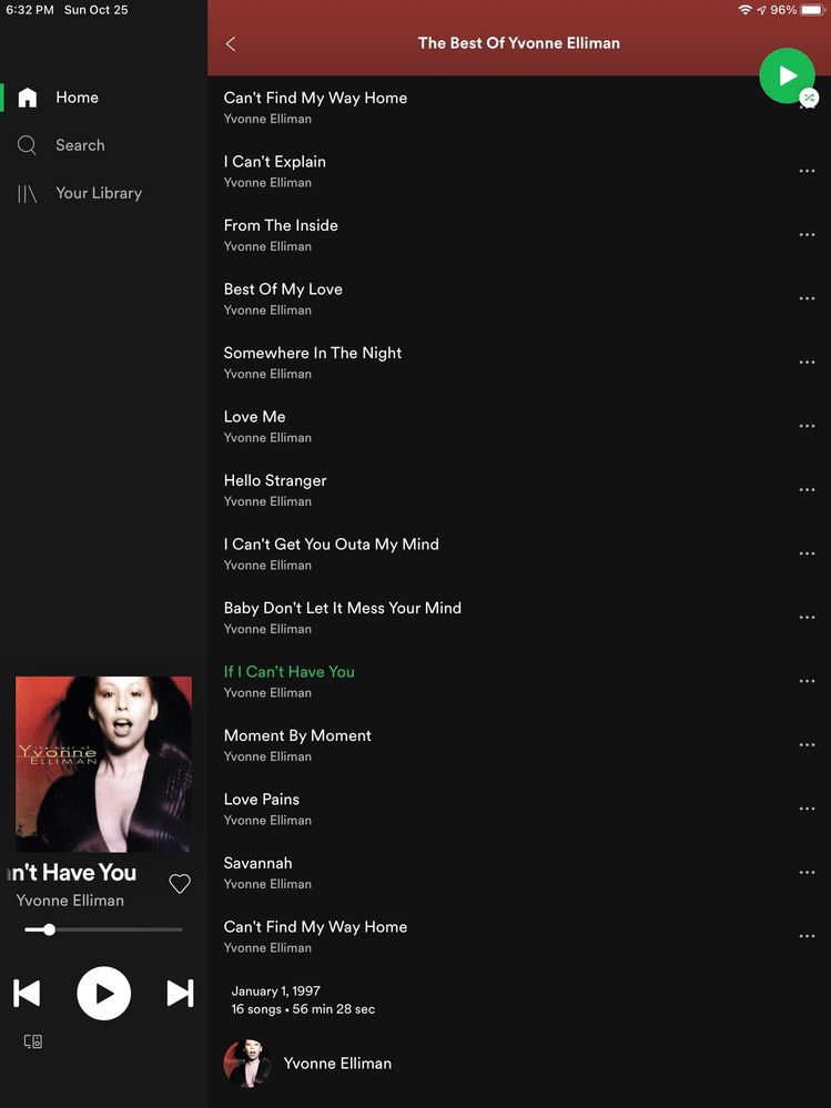
Ok, so it’s not just me. The menu bar used to be at the bottom of the screen. Please give us an option to change the location. The side bar takes away from viewing the home page in full screen mode. This is a screen shot from my iPad. Thank you.
- Mark as New
- Bookmark
- Subscribe
- Mute
- Subscribe to RSS Feed
- Permalink
- Report Inappropriate Content
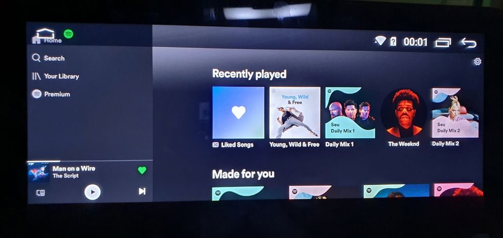
Same problem here, i have a head unite on my car and the new layout make impossible to select the "Home" option on the app.
- Mark as New
- Bookmark
- Subscribe
- Mute
- Subscribe to RSS Feed
- Permalink
- Report Inappropriate Content
Hey there folks,
Thank you for your posts and screenshots.
We're always testing things by adding or removing features to make Spotify better overall. We’re sorry that this means you’re not able to use Spotify like you wish to do at the moment.
We suggest that you follow the steps that's been provided by @Alex regarding creating an idea.
You can read more about how your feedback reach Spotify here.
If you have any questions we're always happy to help.
Cheers 🙂
- Mark as New
- Bookmark
- Subscribe
- Mute
- Subscribe to RSS Feed
- Permalink
- Report Inappropriate Content
- Mark as New
- Bookmark
- Subscribe
- Mute
- Subscribe to RSS Feed
- Permalink
- Report Inappropriate Content
- Mark as New
- Bookmark
- Subscribe
- Mute
- Subscribe to RSS Feed
- Permalink
- Report Inappropriate Content
Lol it's March 2021 and the layout's still the same.
- Mark as New
- Bookmark
- Subscribe
- Mute
- Subscribe to RSS Feed
- Permalink
- Report Inappropriate Content
Suggested posts
Let's introduce ourselves!
Hey there you, Yeah, you! 😁 Welcome - we're glad you joined the Spotify Community! While you here, let's have a fun game and get…

